The site had needed a refresh for a while. I knew exactly what was wrong: images that no longer displayed, the about page a bit empty, tags all over the place… I just never had the motivation to get to it. Now it’s done, so here’s a quick tour of before and now.
Images are back
All the site’s images went through a CDN I’d built myself, a small personal project running on a VPS. The day I cancelled that VPS, the CDN went with it, and all the images went with the CDN. Profile picture included:
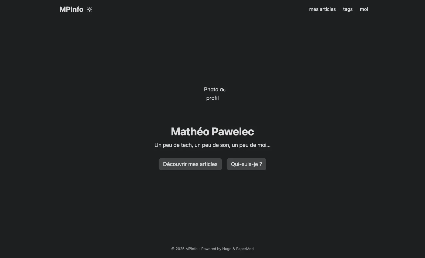
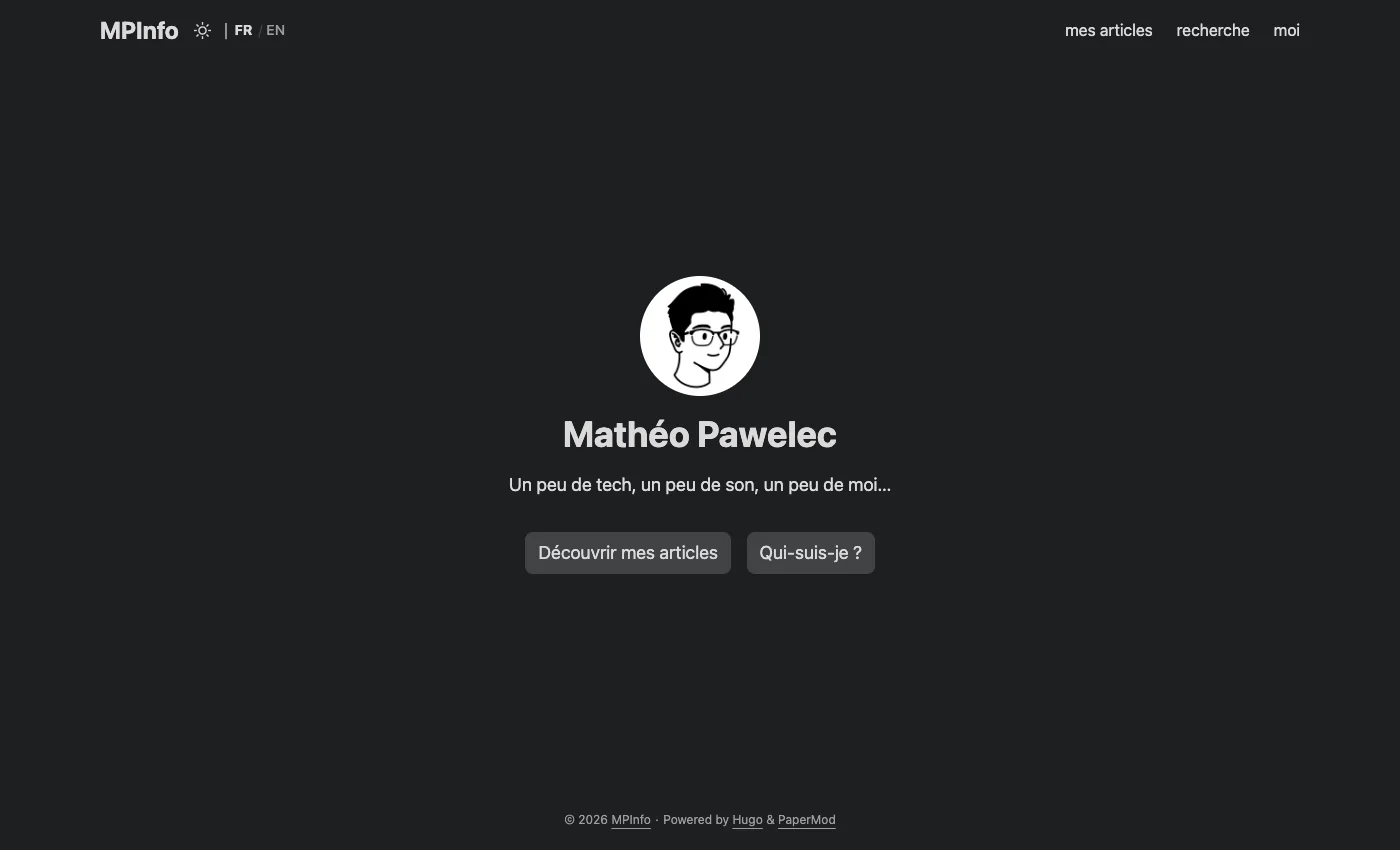
Now, images are served directly by the site, no more dependency on a separate server. And I took the opportunity to replace the photo with a drawn avatar.
The about page becomes a CV
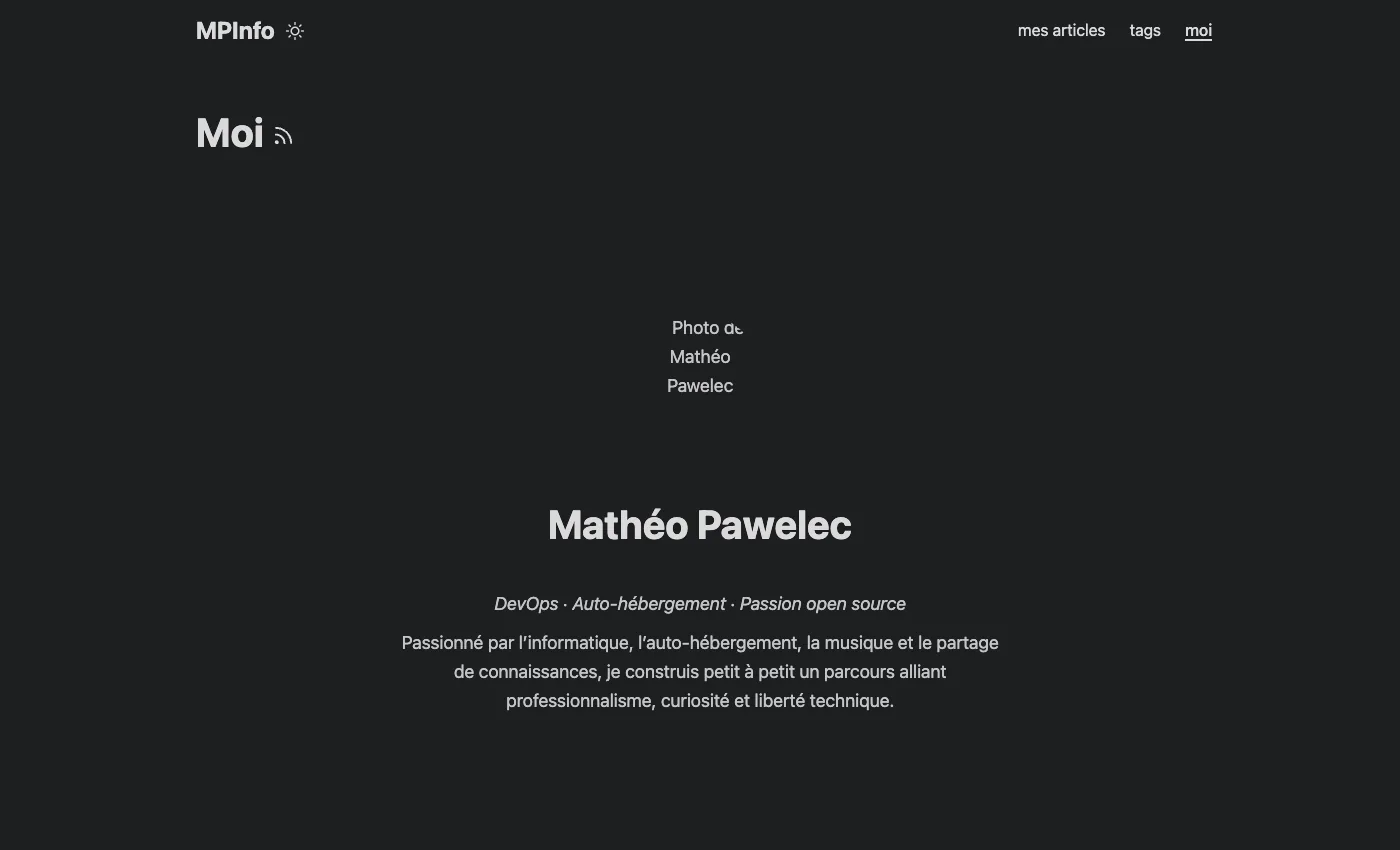
The old page was a (broken) photo, my name and a rather empty paragraph.
Now it’s an actual little CV: my Cloud infrastructure and cybersecurity master’s at Ynov, the company I work at (2Emotion), my skills organized by theme, my projects and what I’m interested in outside of that.
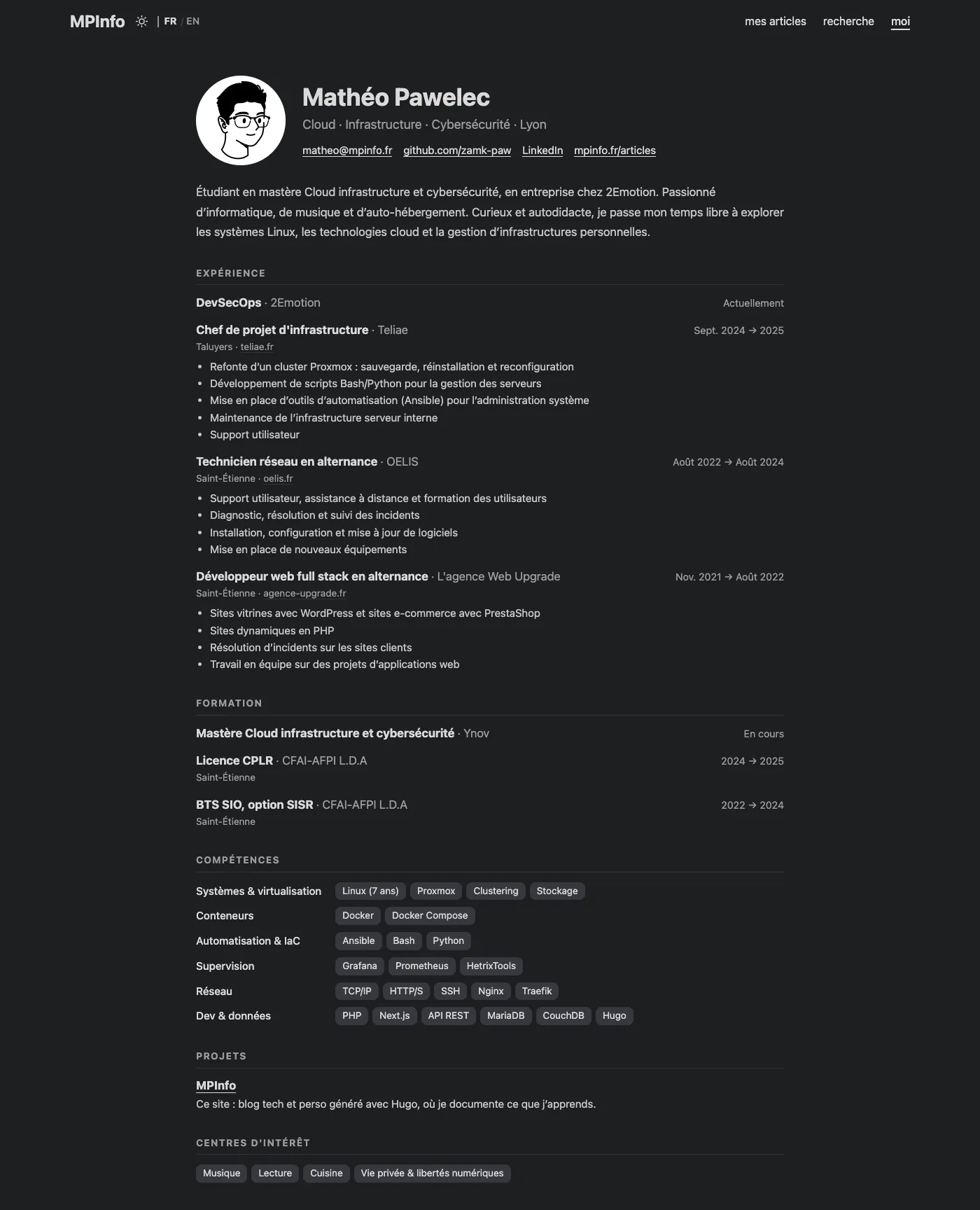
That said, the content isn’t up to date at all for now: there’s still quite a bit missing, and I’ll fill it in over time.
Categories and a search feature
My tags were a bit of a mess. I added them on instinct, things like troupeau-bleu or mark-z-danielewski, and each one had its own page with a single article on it. I redid all of it:
- each article now has a category: Tech, Music, Reading, Society or Personal;
- tags aren’t displayed at all anymore: no more empty pages. They now work behind the scenes, for search and for suggesting related articles.
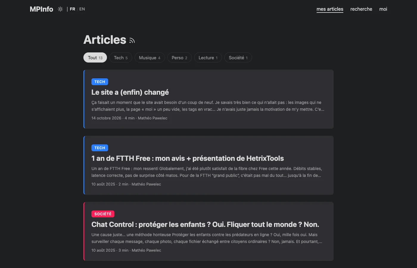
Categories can be filtered directly from the article list, with little badges at the top. That’s clearly my favorite addition.
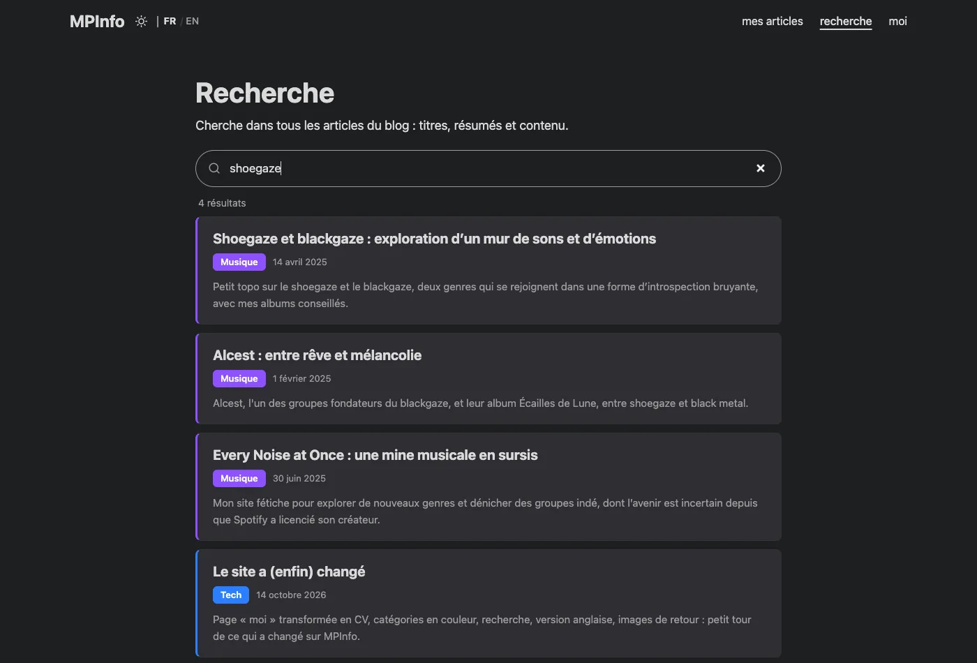
There’s also a search now. It searches through the titles and content of all articles, filters as you type, and tolerates typos: “alcst” still finds Alcest.
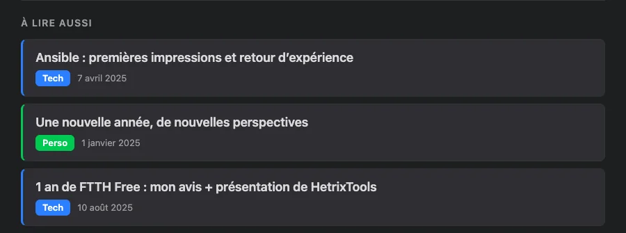
And at the bottom of every article, a “Read next” block suggests three related articles, picked based on the themes they share. A way to jump from one article to the next instead of landing on a tag page with a single article on it.
The site now speaks English too
The whole site is now available in English: articles, CV, search, filters… A small FR / EN switch next to the logo lets you change language, and it takes you straight to the translation of the page you’re on, not back to the home page.
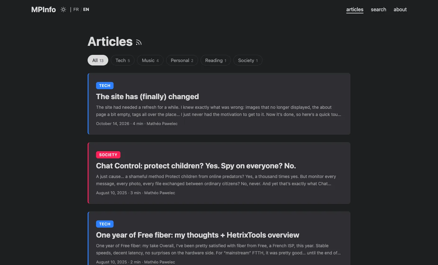
French stays the default language; the English version lives under /en/.
A splash of color
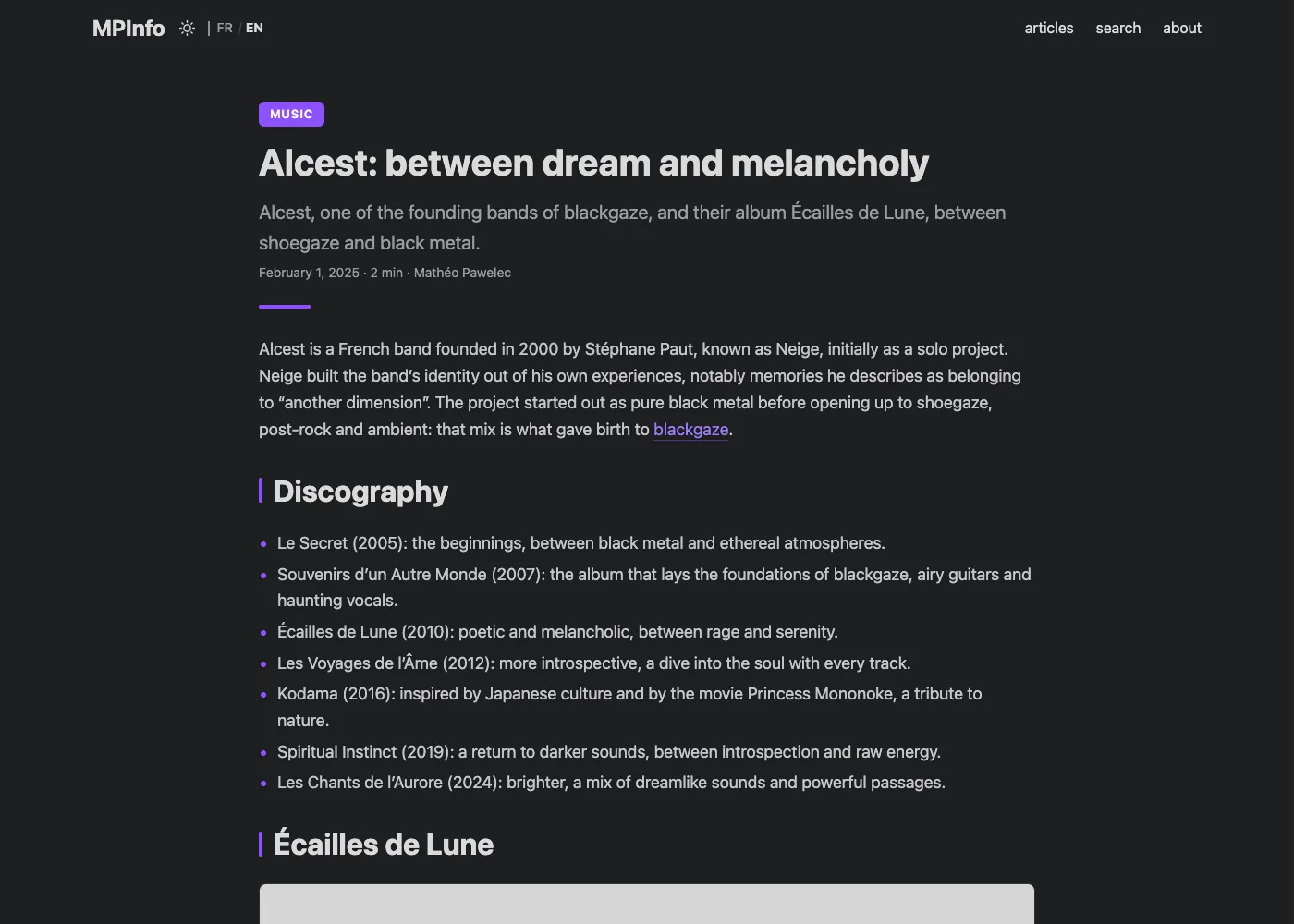
Before, it was black text on a white background (or the other way around), and not much else. Now each category has its own color: blue for tech, violet for music, orange for reading, rose for society and green for personal.
It shows up a bit everywhere: as a badge above each article’s title, on the cards in the list, in front of section headings and in links. A thin bar in the same color also fills up at the top of the screen as you read.
And I now have callout boxes to highlight something, like this one:
More pleasant to read
A few details that had been bothering me for a while:
- on a big screen, the text used to sit in a really thin column in the middle of an ocean of empty space. It’s wider now, without changing anything on mobile;
- in light mode, list pages had a slightly grey background while articles were pure white. Everything’s the same white now;
- dates finally show the right month (before, everything was in “January”, yes);
- and there’s a new favicon, a white M on a black background. Nothing crazy, but the tab finally looks like something.
What’s next?
Update the CV, and most of all start writing again. In January 2025, I promised an article a month… Let’s say this one counts for several.